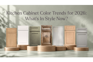


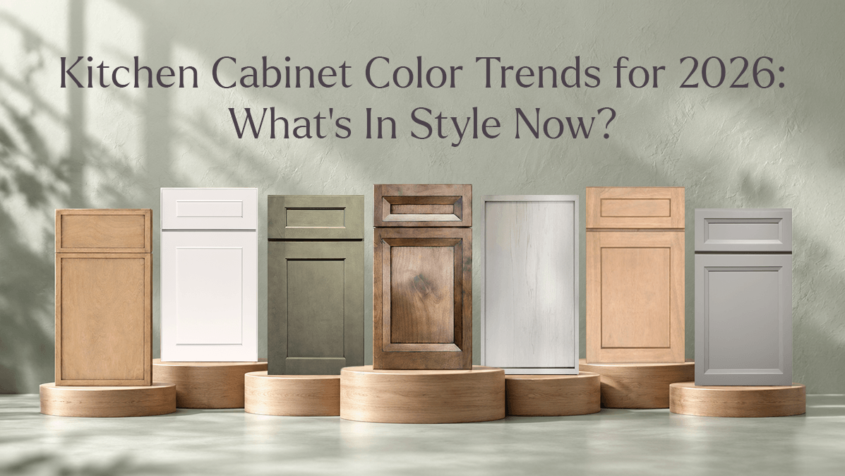
If you've been scrolling kitchen renovation photos lately, you've probably noticed something: the all-white kitchen isn't the automatic default anymore. Homeowners and designers are reaching for color again — not loud, trendy color, but confident, livable color that gives a kitchen some personality without dating it in five years. Looking at what's actually moving in showrooms and design boards, a few clear directions are shaping kitchen cabinet color trends for 2026, and most of them lean toward warmth, texture, and contrast rather than a single "it" shade.
Here's a rundown of what's popular right now, and how to think about picking a color that will still feel right a decade from now.
Warm Neutrals and Oatmeal Tones
Beige got a bad reputation for a while, but its warmer, more textured cousin is having a real moment. Oatmeal, cashmere, and soft ivory tones are showing up everywhere because they do something stark white can't: they add warmth without adding visual weight. A finish like Slim Shaker Oatmeal (SSO) or Liberty Shaker Ivory (LSI) reads as neutral in photos but feels noticeably cozier in person, especially next to warm wood floors or brass hardware. On the Milania side, Cashmere Gloss (M14) and Cashmere Matte (M18) — along with the textured Reeded Cashmere (M36) — bring that same warmth into a sleeker, frameless look. These tones are popular precisely because they're flexible: they work as a full kitchen or as the "quiet" half of a two-tone pairing.
Natural Wood and Oak Finishes
Wood grain is back, and this time it's not about matching everything to a single stain. Rift-cut and washed oak finishes are giving kitchens a lighter, more relaxed wood look than the honey-oak cabinets of decades past. Liberty Shaker Rift-Oak Washed (LSRW) and Slim Shaker Rift-Oak Wash (SSRW) both deliver that effect in a framed cabinet, while Milania's Lakeland Oak 3 (M07) and Beechwood (M27) bring real wood texture to a frameless door. There's also T01 Natural Affinity, a flat-panel finish built specifically around that stripped-back, grain-forward look. Wood tones like these pair well with almost any countertop material, which is part of why they're holding up so well as a long-term choice rather than a passing trend.
Green Kitchen Cabinets
Green has quietly become one of the more requested colors for kitchens, and for good reason — it's earthy enough to feel grounded, but still distinct enough to give a room a focal point. Milania's Forest Green (M22) is the standout here: deep enough to work as an island or a full run of cabinets without overwhelming the space, especially against warm wood accents or brass fixtures. Green tends to work best used with intention — as an island, a wall of uppers, or a butler's pantry — rather than covering every surface, which keeps the kitchen feeling designed rather than themed.
Blue Kitchen Cabinets
Blue has stuck around for a while now, and 2026 is leaning toward richer, more saturated versions of it rather than pale coastal blues. Liberty Shaker Blue (LSB) offers a classic, slightly muted navy that reads as timeless rather than trendy, while Milania's Indigo Blue Gloss (M08) takes the same color family into a high-shine, contemporary finish. Blue is popular because it behaves a bit like black — it grounds a kitchen and makes lighter countertops and backsplashes pop — but it feels a touch warmer and less severe.
Black and Dark Cabinet Colors
Dark cabinets have moved past being a bold statement and into being a genuinely mainstream choice. Liberty Shaker Black Oak (LSBO) keeps visible wood grain under a black finish, which softens the look compared to a flat black. On the Milania side, there's a lot of range: Negro Matte (M10) and Negro Gloss (M12) for a cleaner, more graphic look, Carbon Frozen Wood (M03) for texture, and Reeded Black (M34) for cabinets with fluted detailing that catches light. Dark cabinets photograph dramatically, but the more practical draw is how well they hide daily wear — fingerprints and smudges show up far less than on matte white.
White and Soft Neutral Cabinets
White cabinets aren't going anywhere, but they've gotten more nuanced. Instead of one flat "white," there's now a whole range depending on the look you want: Liberty Shaker White Modern (LSWM) for a crisp, classic shaker profile, Blanco Gloss (M09) or Blanco Matte (M11) for frameless kitchens, and White Frozen Wood (M04) or Reeded White (M35) when you want texture instead of a flat panel. The shift here is toward warmer, softer whites with visible texture — a reaction against the very sterile, ultra-glossy white kitchens that were everywhere a few years ago.
Two-Tone Kitchen Cabinet Color Ideas
Two-tone kitchens remain one of the easiest ways to bring in a bolder color without committing your whole kitchen to it. The formula that keeps working: a neutral or wood tone on the perimeter, paired with a stronger color on the island. Think Liberty Shaker Grey (LSG) uppers with a Canyon Brown (CB) island, or White Frozen Wood (M04) cabinetry anchored by a Forest Green (M22) island. Another approach that's gaining ground is splitting uppers and lowers — a lighter wood or cashmere tone up top, with something darker like Antracita (M32) or Liberty Shaker Sable (LSS) below, which visually grounds the room without darkening it entirely.
How to Choose a Cabinet Color for Your Kitchen
With this many options, the choice usually comes down to a few practical questions rather than just what's trending:
- How much natural light does the kitchen get? North-facing or low-light kitchens tend to handle warm tones and lighter neutrals better than cool grays or true black.
- How long do you want this to last? A neutral or wood-tone base with a bolder island color tends to age better than an all-over trend color, since you can update the island or hardware later without redoing the whole kitchen.
- What's staying the same? Countertops, flooring, and backsplash usually cost more to change than cabinets, so it's worth choosing a cabinet color that works with what's already there — or already decided — rather than the other way around.
- See it at scale. A finish sample looks different across an entire wall of cabinetry than it does as a small swatch, so it's worth requesting a larger sample or viewing a finish in a showroom before committing.
Frequently Asked Questions
What is the most popular kitchen cabinet color for 2026?
There isn't one single winner — warm neutrals, natural wood tones, and dark colors like black or deep green are all trending at once. What's changed is the finish quality: even a neutral like white or cashmere now usually comes with texture or grain rather than a flat, glossy surface.
Are dark cabinets still in style, or are they on their way out?
They're still very much in style, and increasingly used as a practical choice rather than just a bold one. Finishes like black oak or matte black hide fingerprints and daily wear better than light, flat colors, which is a big part of why they've stuck around.
What cabinet color works best in a small kitchen?
Lighter neutrals and warm whites still open up a small space the most, but they don't have to be the only color in the room. A common approach is keeping the perimeter light and saving a stronger color, like blue or green, for a single accent — an island, a pantry wall, or open shelving.
Do cabinets need to match the countertop, or is contrast better?
Contrast generally reads as more intentional than a close match. Pairing a dark or colorful cabinet with a lighter countertop (or the reverse) tends to look more designed, while cabinets and countertops in very similar tones can end up looking accidental rather than coordinated.
You can browse the full range of ProCraft Signature and Milania finishes, or look through the complete product collection to see how these colors and door styles look side by side.